

Minimalist Sculptures for Modern Home Decor: A Buyer's Guide
A single well-placed sculpture can do more for a room than an entire wall of framed prints. It has weight, shadow, and presence — it changes as you walk past it, catches light differently through the day, and gives a space a sense of intention that flat art can't quite match. But minimalist interiors are unforgiving. Add the wrong piece and it reads as clutter, not curation. Here's how to actually get it right.
What makes a sculpture "minimalist" in the first place
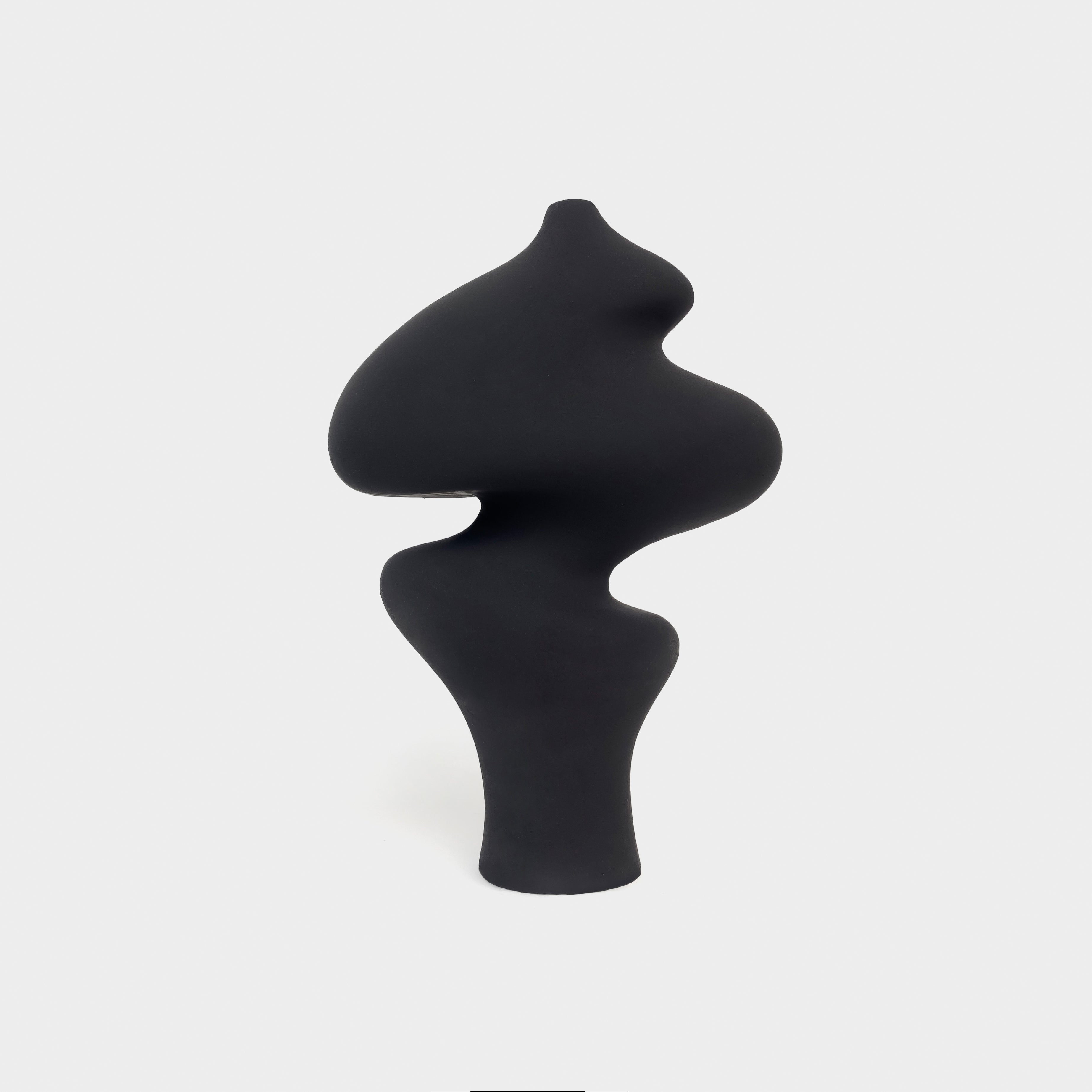
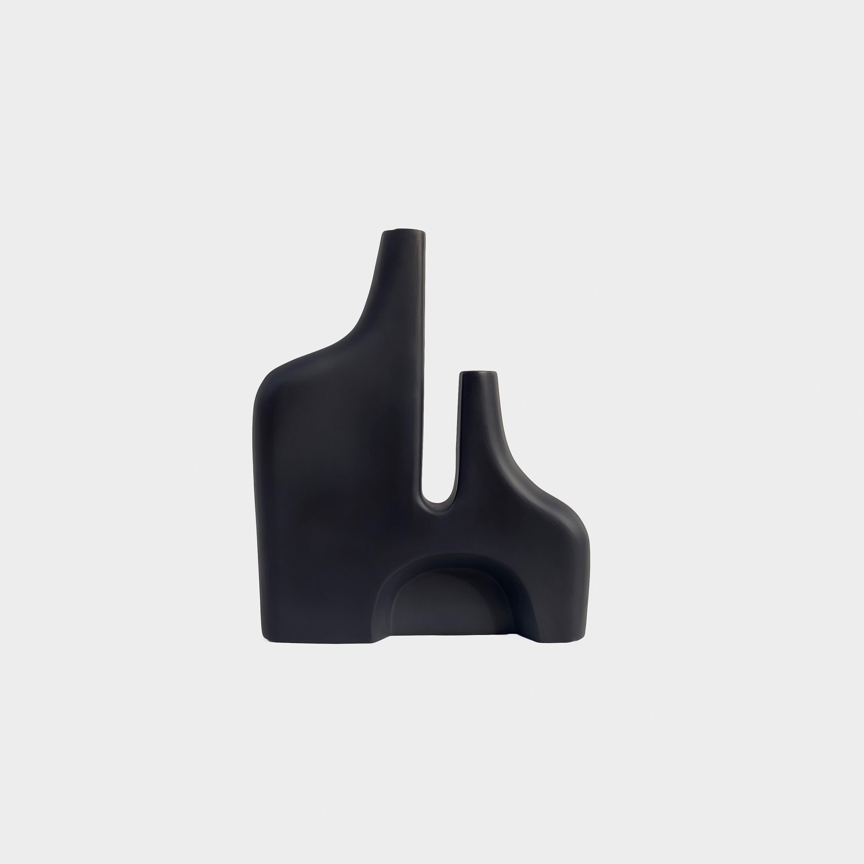
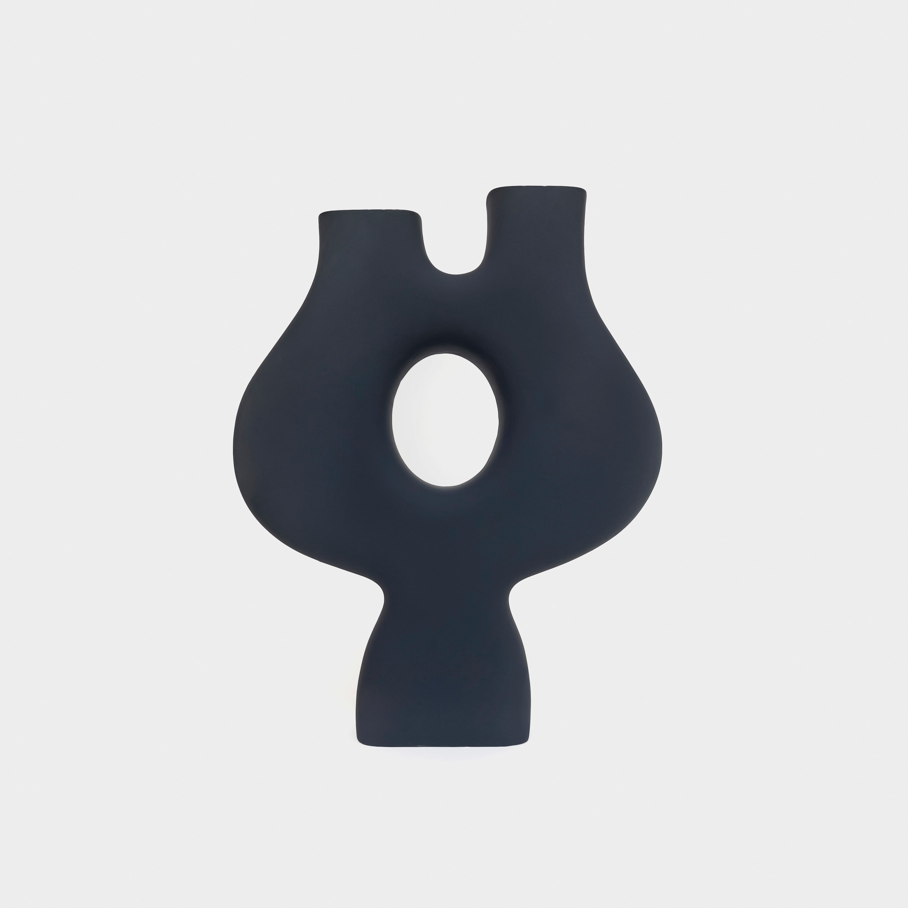
Minimalist doesn't mean plain — it means every curve and edge is doing something. Look for abstract, organic forms rather than literal figures (a smooth abstract shape ages better on a shelf than a detailed statue, which can start to feel busy after a few months). Matte finishes over glossy ones, since gloss catches light unpredictably and competes with everything around it. And a limited, neutral color palette — charcoal, ivory, sand, muted stone tones — so the piece works with your existing decor instead of demanding its own color scheme.
Choosing the right size for your space
This is where most people get it wrong. A sculpture under 20cm tends to disappear on anything larger than a side table — it reads as an accessory rather than a statement. For a coffee table or console, look in the 22–30cm range, tall enough to hold its own in the room without dominating a shelf of books or a scatter of smaller objects. For a genuine "anchor piece" — something meant to be the focal point of a console or entryway table on its own — go above 30cm, ideally with some real weight to the material so it feels substantial in hand as well as in photos.
Material matters more than people think
Resin and lightweight ceramic are common, but a cast composite blend gives you the visual weight of stone at a fraction of the price and shipping cost. When you're comparing pieces online, weight is actually a decent proxy for material honesty — a genuinely solid-feeling sculpture in the 1–1.5kg range for a 25cm piece tells you it's not hollow plastic dressed up in a matte photo.
Where to actually place it
Three placements do almost all the work in a minimalist home:
- The console or entryway table — one sculpture, left with generous empty space around it, makes a stronger first impression than a table crowded with objects.
- The bookshelf gap — leave one shelf compartment intentionally sparse and let a single sculpture occupy it instead of more books. It gives the eye a place to rest.
- The coffee table — pair it with one other object (a small tray, a single stem in a vase) rather than a full tablescape. Minimalism is as much about what you leave out as what you choose.
Styling by color palette
- Warm neutral rooms (beige, terracotta, wood tones): go for sand or mocha-toned sculptures — they blend rather than contrast.
- Cool, Scandinavian-leaning rooms (white, grey, pale wood): charcoal or noir pieces give definition and a visual anchor against an otherwise light palette.
- Bold or colorful rooms: this is the one place a single cobalt or unexpected-toned piece can work — as the one deliberate accent rather than blending in.
A quick checklist before you buy
- Abstract form over literal figure
- Matte, not glossy, finish
- Size matched to where it's actually going (measure first)
- Weight that feels intentional, not hollow
- One dominant undertone that complements your existing palette
A good minimalist sculpture isn't the loudest thing in the room — it's the thing that makes everything else look more considered. Explore our full sculpture collection to find a piece for your space.
